How the mobile-optimized layout works for on-set reference.
Dayframe's schedule layout is built to be readable on phones and tablets. Your crew can pull up the schedule on set without pinching and zooming through a spreadsheet.
How to view on mobile
Open a shared link on your phone or tablet. The schedule automatically displays a mobile-optimized layout. No app download or Dayframe account required.
What the mobile view looks like
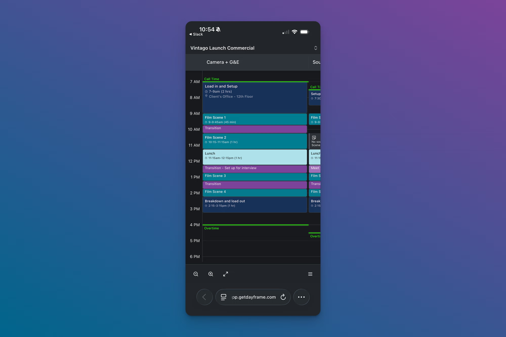
The mobile view shows the same schedule content as desktop, adapted for a smaller screen:
The project name appears at the top with an options icon in the top right.
Lanes scroll horizontally. Swipe left and right to move between departments.
Time blocks display the title, time range, duration, and location. Blocks are sized proportionally so you can see the shape of your day at a glance.
Call Time and Overtime indicators are visible on each lane.
Zoom controls and a Fit to window button sit at the bottom left of the screen.
The mobile Options menu
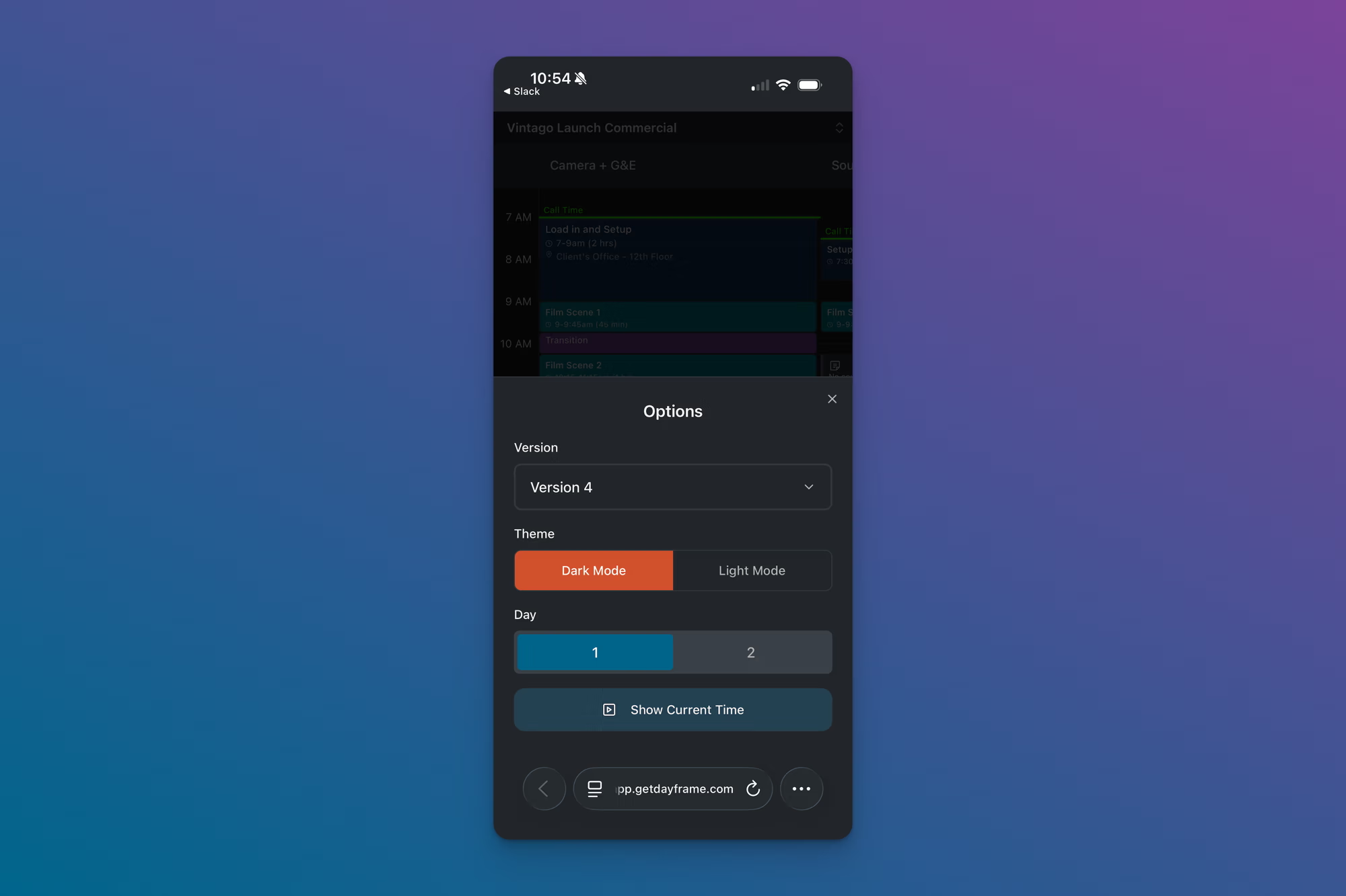
Tap the menu icon (three horizontal lines) in the bottom right to open the Options panel. From here you can:
Version — switch between saved versions of the schedule using a dropdown.
Theme — toggle between Dark Mode and Light Mode.
Day — switch between shoot days on a multi-day project.
Show Current Time — toggle the current time indicator on or off.
Tips
Send your crew the shared link, not the PDF. The shared link is mobile-optimized and always shows the latest version. The PDF is better for printing and call sheet attachments.
Crew members don't need a Dayframe account to view a shared link on their phone.
Bookmark the shared link on your phone's home screen for quick access on set.
If text is too small, use the zoom controls at the bottom of the screen to zoom in. Remember that more note detail becomes visible as you zoom in.